How Calligraphy Enhanced Medieval Manuscripts: Techniques and Styles
You'll find that medieval calligraphy turned manuscripts into veritable artworks, blending beauty with functionality. Skilled scribes used quills and ink on carefully prepared parchment, crafting styles like the Carolingian minuscule and Gothic script. Each script had distinct features; the former offered clarity and standardization, while the latter showcased intricate, angular letters for a dramatic effect. Monks added detailed illuminations and gold leaf, elevating the manuscripts' decorative appeal. These elements not only improved readability but also enriched the cultural and artistic value of the texts. There's a lot more to uncover about how these techniques shaped historical art and communication.
Origins of Medieval Calligraphy
Many might wonder where the intricate beauty of medieval calligraphy began. You're about to plunge into a fascinating expedition of early influences and script evolution. Initially, the roots of medieval calligraphy can be traced back to the Roman Empire, where scribes crafted elegant letters. As you investigate further, you'll find that the fall of Rome didn't halt the progression of script styles but rather opened new avenues for development.
In the early medieval period, you'd notice that monasteries became the epicenters for script evolution. Monks carefully copied religious texts, gradually refining their techniques. They borrowed elements from Roman scripts, then incorporated regional influences, giving rise to unique styles like Insular script in Britain and Carolingian minuscule in the Frankish Empire. Each style reflected cultural exchanges and the necessity for readability in religious and scholarly texts.
As you probe deeper, you'll understand how these scripts evolved further due to the need for more efficient writing systems. Over time, this led to the creation of Gothic script with its distinct, ornate style. You can see how early influences and continuous script evolution shaped the remarkable artistry of medieval calligraphy.
Tools and Materials Used
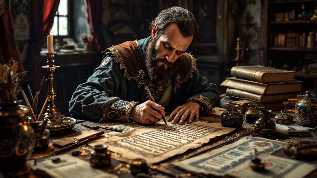
In medieval calligraphy, the tools and materials were as vital as the artistry itself. You'd find that scribes relied on a few key instruments to create beautiful manuscripts. The quill, often made from goose feathers, was their primary writing tool. It had to be carefully cut and regularly maintained to guarantee precision. The type of ink used was significant, with carbon and iron gall ink being the most common ink types. Carbon ink, made from soot, was known for its durability and deep black hue. Iron gall ink, derived from tannin-rich oak galls, offered a rich, dark color that adhered well to parchment.
When it comes to writing surfaces, parchment and vellum were mainly used. Parchment, crafted from animal skins, provided a smooth and durable surface for writing. Vellum, a finer quality of parchment, was highly prized for its texture and appearance. These surfaces needed careful preparation, including stretching and scraping, to make sure they were suitable for calligraphy. You'd also notice that scribes sometimes used a pumice stone to polish the surface for better ink adhesion. With the right tools and materials, medieval calligraphy truly came to life on these pages.
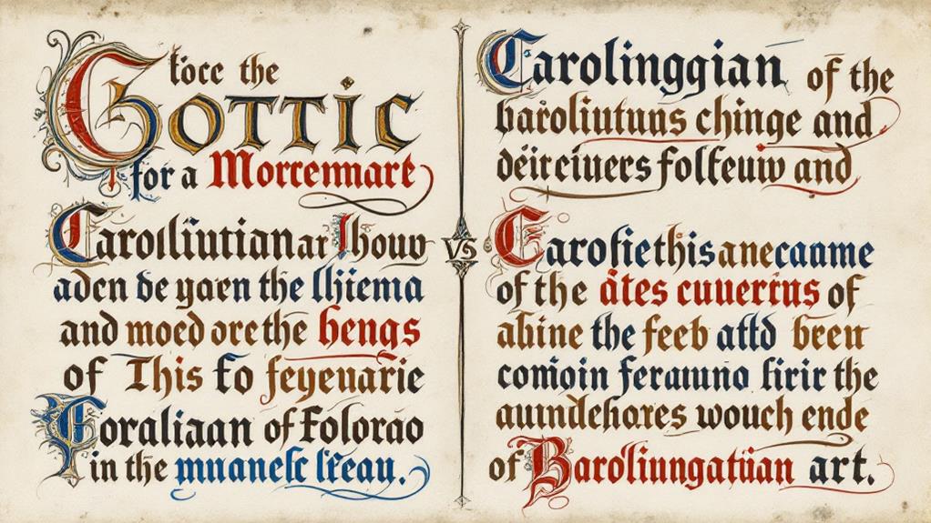
Carolingian Minuscule
A significant development in the domain of medieval calligraphy, Carolingian Minuscule, transformed written communication during the Carolingian Renaissance. You'll find that this script was designed under the Carolingian influence to standardize writing across the empire. Before its introduction, manuscripts suffered from regional script variations that made reading difficult. With Carolingian Minuscule, script evolution reached a point where uniformity and ease of reading were prioritized, greatly enhancing the accessibility of texts.
When you examine a manuscript written in this style, you'll notice its clear, rounded letters. The spaces between words are distinct, making the text much more readable compared to earlier scripts. This was intentional, as it facilitated learning and communication throughout the empire. Scribes adopted this script in monasteries and scriptoria, ensuring that sacred and scholarly texts could be copied and disseminated efficiently.
Moreover, Carolingian Minuscule's impact didn't end with the Carolingian Renaissance. Its clear style paved the way for future script developments, influencing the evolution of later scripts, including the ones used in early modern printed books. By embracing Carolingian Minuscule, you witness a significant moment in the history of written language.
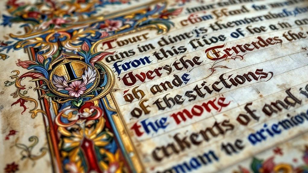
Gothic Script Characteristics
Elegance and complexity define the essence of Gothic script, setting it apart from its predecessors. As you investigate this unique style, you'll notice the intricate details and sharp angles that characterize its gothic aesthetics. This script evolved during the medieval age, reflecting a shift towards more decorative and dense writing. Here's what makes Gothic script truly stand out:
- Angular Forms: Unlike the rounded shapes of earlier scripts, Gothic script features angular, pointed letters. This change in form contributes to its distinctive appearance and reinforces the gothic aesthetics.
- Dense Textures: The use of tightly packed letters creates a darker and more textured look on the page. This density was part of the script evolution, accommodating the need for more text in limited space.
- Vertical Strokes: Emphasizing vertical lines gives the script an impressive, towering effect. It adds a sense of grandeur and reverence that was ideal for religious manuscripts.
When you investigate Gothic script, appreciate how each stroke and form reflects the broader script evolution of the medieval age. Its unique characteristics not only improved manuscripts but also left a lasting impact on the art of calligraphy.
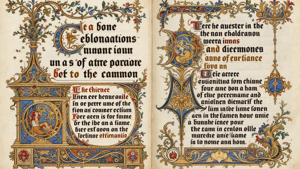
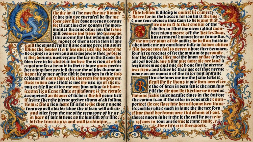
Illumination and Ornamentation
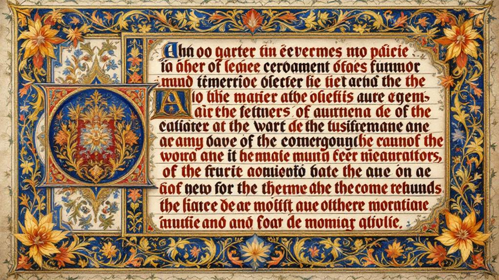
Amidst the beautiful tradition of medieval manuscripts, illumination and ornamentation stand out as artistic expressions that augment the written word. When you investigate these manuscripts, you'll notice how illumination brings pages to life with lively colors and intricate designs. Artists often used gold leaf to create dazzling effects, making the illustrations shimmer and catch your eye. This technique added a sense of luxury and divine light to religious texts, reflecting the importance of the content.
As you look closer, decorative borders frame the text, transforming each page into a masterpiece. These borders aren't just simple outlines; they're rich with patterns, vines, and sometimes tiny creatures or scenes. They guide your eye across the page, creating a visual expedition that complements the narrative. The skillful use of color and detail in these borders guarantees that they don't overshadow the text but instead amplify its beauty.
Incorporating illumination and ornamentation wasn't just about aesthetics; it was a way to emphasize the manuscript's significance. By using techniques like gold leaf and decorative borders, artists turned each manuscript into a unique work of art, a reflection of the period's creativity and devotion.
Cultural Significance and Influence
Throughout history, medieval manuscripts have held immense cultural significance, influencing art, religion, and literature. When you investigate their creation, you'll uncover how calligraphy played a key role in this impact. Calligraphy wasn't just a method of writing; it was an artistic expression that enhanced the text. Through intricate lettering and the incorporation of religious symbolism, it transformed manuscripts into revered objects of devotion and learning.
Consider these three ways medieval calligraphy influenced culture:
- Religious Symbolism: Calligraphers often embedded spiritual icons within their letters, enhancing the manuscript's sacred nature. You'd find these symbols reinforcing the text's religious themes, making the manuscript both a work of art and worship.
- Artistic Expression: Calligraphy brought a visual elegance that went beyond words. The creativity in the scripts inspired other art forms, leading to the development of unique styles in painting and other decorative arts.
- Literary Impact: The beauty of calligraphic manuscripts made literature more accessible and desirable. You'd see how these works encouraged the spread of stories and knowledge, shaping medieval society's intellectual landscape.
Legacy of Medieval Calligraphy
Medieval calligraphy has left a lasting mark on our world, influencing everything from modern typography to artistic education. When you look at the fonts and styles today, you can trace their roots back to the script evolution that began in the Middle Ages. Script styles like Carolingian minuscule laid the groundwork for our lowercase letters, while Gothic scripts added flair and complexity that captivated the eye.
As you investigate further, you'll notice how medieval calligraphic schools honed the skills of scribes, creating a legacy of precision and beauty. These schools didn't just pass down techniques; they fostered a culture of craftsmanship and dedication. You can see their influence in the careful nature of modern calligraphy and the appreciation for handwritten art.
Today, the legacy of medieval calligraphy is alive in digital fonts and design courses around the world. By understanding the past, you gain insight into how these ancient styles continue to shape our visual landscapes. Regardless of whether you're designing a logo or teaching a class, the echoes of medieval calligraphy remind you that beauty and function can coexist, inspiring creativity in every stroke.
Related posts