Gothic vs. Carolingian Script: Styles and Their Influence on Manuscript Art
When exploring Gothic and Carolingian scripts, you'll find that they each have distinct styles reflecting their time periods. Carolingian script, originating in the 8th century under Charlemagne, features rounded and clear letters, enhancing readability and standardizing text across the Frankish Empire. This script was crucial in preserving knowledge. In contrast, the Gothic script from the 12th century is characterized by its angular, dense letters and intricate decorations, emerging alongside Europe's expanding universities and demand for books. These scripts influenced manuscript art, showcasing the evolving cultural and intellectual landscape of medieval Europe. There's much more to uncover about their legacy.
Origins of Carolingian Script
The Carolingian script, a fundamental element of medieval handwriting, emerged during the reign of Charlemagne in the late 8th to early 9th centuries. You might be curious about its historical development, which was part of Charlemagne's mission to standardize and reform written texts across his empire. This script's creation aimed to unify the diverse writing styles found in the Frankish territories, making communication and record-keeping more efficient. The historical development of Carolingian script involved a deliberate effort to simplify and clarify the written word, enhancing legibility compared to the more complex scripts that preceded it.
When exploring regional variations, you'll notice that while Carolingian script was designed to be consistent, slight differences appeared as it spread across Europe. These variations reflected local scribes' influences and the specific needs of different regions. In places like France, Germany, and Italy, adaptations to the script occurred, showing the adaptability and reach of Carolingian script. As you study these origins, you can appreciate how the script played a vital role in preserving and disseminating knowledge, setting a foundation for future manuscript development and influencing the evolution of Western writing systems.
Characteristics of Carolingian Script
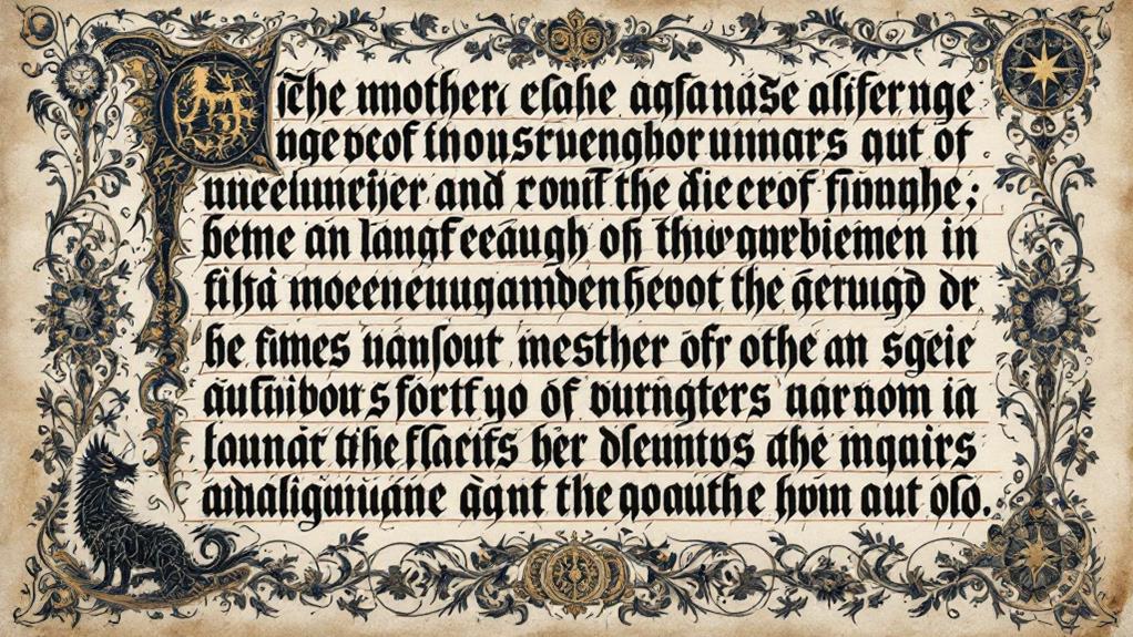
You'll immediately notice several defining characteristics of Carolingian script that set it apart from earlier, more convoluted scripts. Initially, the letter forms are rounded and spacious, offering an elegant simplicity that improves readability. This clarity is a direct result of scribal practices focused on uniformity and consistency during manuscript production. When you examine a Carolingian manuscript, you'll see a careful text layout that prioritizes a clear visual hierarchy, making it easier to distinguish between headings, main text, and annotations.
The calligraphic techniques employed are precise, emphasizing evenly spaced letters and lines. This systematic approach guarantees that the text flows smoothly across the page. You'll find that ink types used in Carolingian manuscripts typically include rich blacks and sometimes browns, providing a stark contrast against the high-quality parchment. Parchment quality was vital, as smoother surfaces allowed for the fine detail work that characterizes this script.
In essence, Carolingian script reflects a harmonious balance between form and function. Its design principles have a timeless appeal, and its influence can still be seen in modern typefaces that value clarity and elegance. By understanding these characteristics, you gain insight into the artistry and practicality of medieval manuscript production.
Impact on Medieval Literacy
How did the adoption of Carolingian script transform medieval literacy? By standardizing handwriting, Carolingian script made texts more accessible and easier to read. This uniformity played a vital role in medieval education as it facilitated the teaching and learning processes. When you look at manuscripts from this period, you'll notice their clear, legible letters, which helped spread knowledge across Europe.
Script dissemination became more efficient with Carolingian script, as it allowed scribes to produce copies of texts at a quicker pace and with fewer errors. This widespread availability of texts meant that monasteries, schools, and scholars could access fundamental works of literature, philosophy, and theology. As a result, literacy rates improved among the educated classes, and there was a gradual expansion of literacy beyond the clergy.
You might wonder why this mattered so much. Well, with more people able to read, there was a wider exchange of ideas and information. This exchange laid the groundwork for intellectual growth, setting the stage for future cultural and educational developments. Essentially, Carolingian script didn't just change the way texts looked—it transformed the very landscape of medieval learning and literacy.
Emergence of Gothic Script
While Carolingian script had transformed medieval literacy, a new style known as Gothic script began to emerge in the 12th century. You might wonder why this script change occurred. During this period, Europe was experiencing significant alterations that influenced the way manuscripts were produced. A growing demand for books, combined with the expansion of universities, required a script that could be written more quickly and compactly.
As you investigate this change, you'll notice that Gothic evolution wasn't just about speed. The script's angular, condensed form allowed scribes to fit more text on a page, making books more economical and portable. This was a practical response to the needs of an increasingly literate society keen for knowledge.
You can see this evolution as a reflection of societal changes. The Gothic script's intricate design mirrored the complex architecture of the time, such as cathedrals adorned with pointed arches and intricate stone carvings. As you examine the shift from Carolingian to Gothic, you'll find that it wasn't merely a change in aesthetics but a response to cultural and educational demands. This script change marked a new period in manuscript art, influencing how people engaged with written texts.
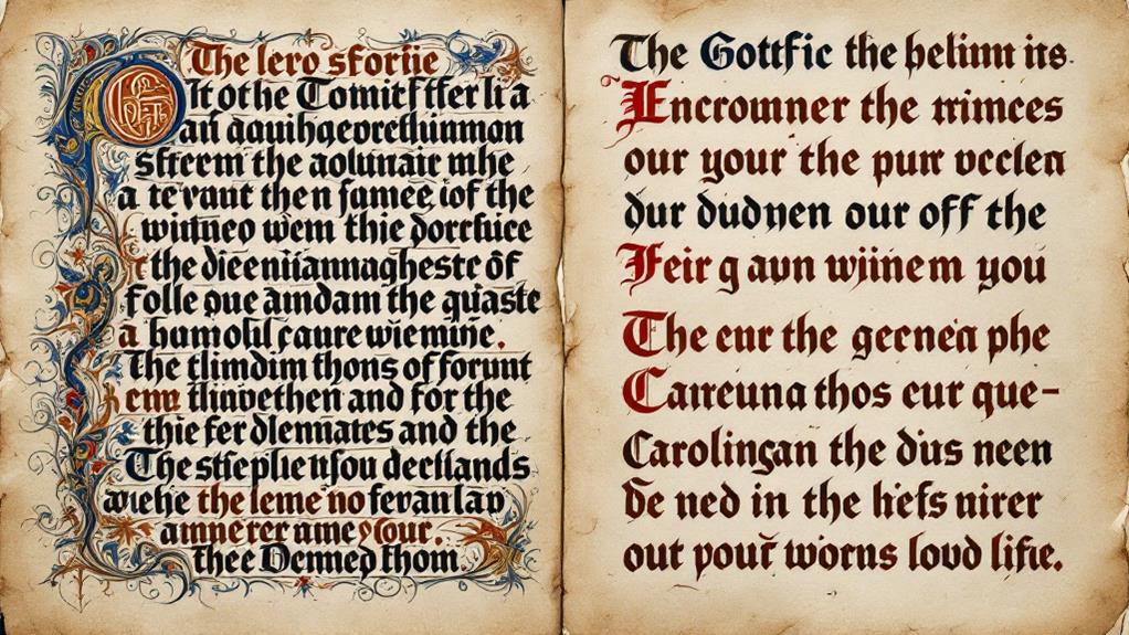
Features of Gothic Script
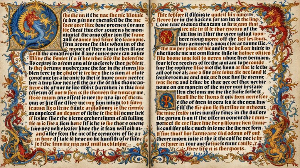
When examining the features of Gothic script, you'll notice its distinct angular and dense letterforms that set it apart from its predecessors. This script's ornate lettering reflects a stylistic evolution from earlier scripts, emphasizing verticality and compactness. The sharp, pointed edges of the letters create a visually striking appearance, making it immediately recognizable. Gothic script often uses elaborate decorations, with intricate patterns that adorn the ends and intersections of letters, enhancing its ornate quality.
As you investigate this script, pay attention to the uniformity of its strokes. The consistent width of lines in Gothic script contributes to its dense and block-like appearance. The letters are tightly packed, which allowed scribes to fit more text on a page, a crucial feature during times when parchment was expensive and scarce. This functional aspect didn't compromise its aesthetic appeal; instead, it added to the script's unique charm.
Additionally, Gothic script evolved into different styles, such as Textura and Rotunda, each with its variations in letterforms and decoration. This adaptability shows the script's ability to cater to different artistic and practical needs, marking a significant point in the stylistic evolution of medieval manuscripts.
Cultural Context of Gothic Style
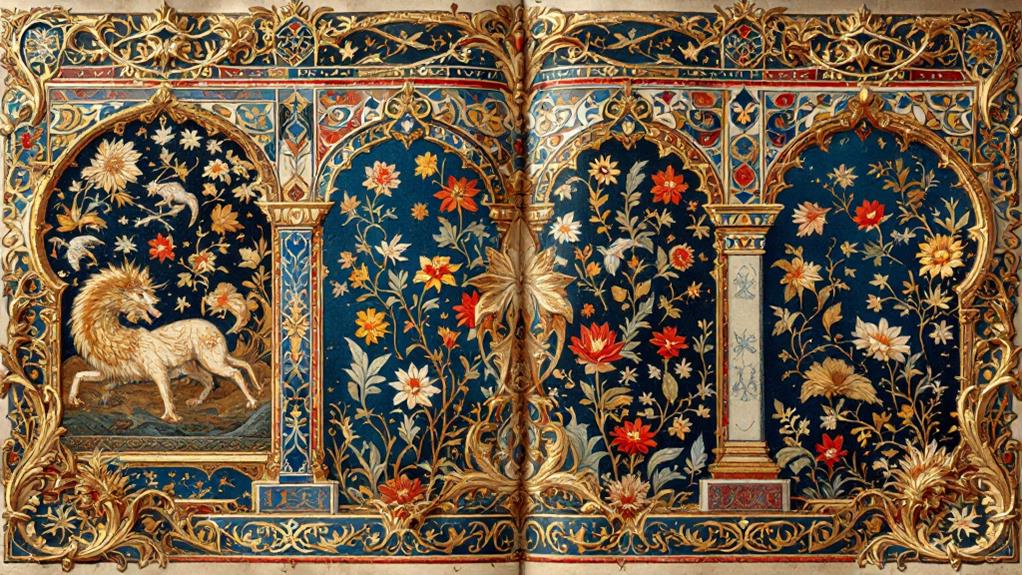
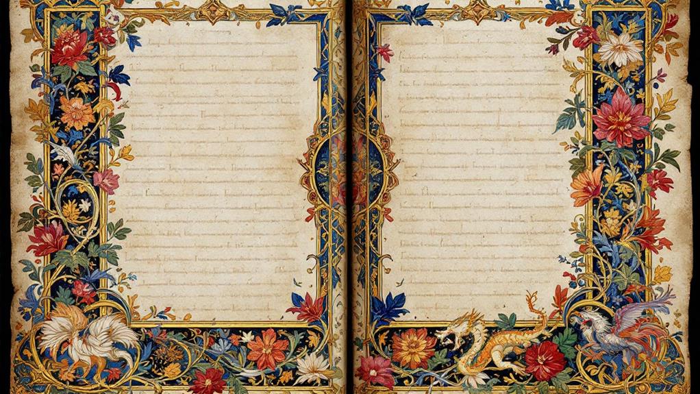
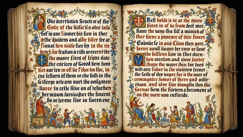
The Gothic style didn't just evolve in isolation; it was deeply influenced by the cultural shifts of medieval Europe. During this time, medieval architecture soared with towering cathedrals, embodying more than just structural feats—they were cultural symbols of faith and power. As you investigate Gothic artistic expressions, you'll notice how these structures' intricate designs inspired manuscript illumination, where texts became visual celebrations of religious influences.
Societal changes also played a significant role. As towns grew and trade flourished, a more literate society emerged, demanding richly decorated manuscripts. This historical significance is evident in the detailed illustrations and ornate lettering of Gothic scripts, reflecting the period's intellectual and spiritual quests.
Regional variations added another layer to the Gothic style's evolution. In different parts of Europe, you'll find distinct adaptations, each mirroring local customs and tastes. These variations highlight the adaptability and widespread appeal of Gothic aesthetics, which were not confined to any single region. Understanding this cultural context helps you appreciate how Gothic style wasn't merely an artistic trend—it was an all-encompassing expression of medieval Europe's dynamic and evolving landscape.
Comparative Analysis of Scripts
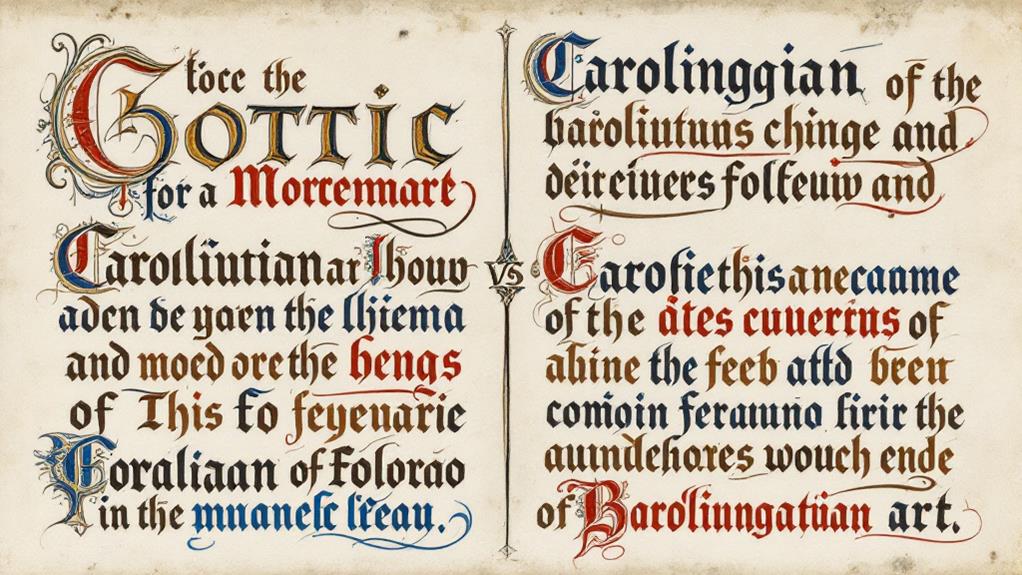
In exploring the comparative analysis of Gothic and Carolingian scripts, you'll uncover distinct characteristics that set these two styles apart. The Carolingian script, emerging during the 8th century under Charlemagne's reign, holds historical significance as it aimed to standardize writing across his empire. Its rounded, clear letters made reading and copying texts more efficient, marking a shift towards uniformity and readability that influenced Western Europe for centuries.
On the other hand, Gothic script developed in the 12th century, reflecting changing aesthetic preferences. Its angular, dense letters with elaborate vertical lines created a dramatic, ornate look, which became synonymous with the grandeur of Gothic architecture. This script's stylistic differences include tightly packed letters and a more compact appearance, making manuscripts appear richer but often harder to read compared to the Carolingian script.
When you compare these scripts, you'll notice how each reflects its period's values and needs. The Carolingian script prioritized clarity and accessibility, while the Gothic script welcomed complexity and decorative flair. Understanding these distinctions allows you to appreciate the scripts not just as writing systems, but as reflections of their respective cultural and historical contexts.
Legacy in Manuscript Art
Understanding the distinct features of Gothic and Carolingian scripts improves your appreciation of their lasting impact on manuscript art. These scripts didn't just serve as writing styles but as vital elements of manuscript preservation and artistic symbolism. The Carolingian script, with its clear and legible form, laid the foundation for modern typefaces, ensuring texts were preserved through ease of reading and copying. Its influence is evident in the way manuscripts were carefully maintained, reflecting a commitment to preserving knowledge.
On the other hand, the Gothic script introduced a dramatic flair with its ornate and complex design. This style wasn't merely about aesthetics; it infused manuscripts with a sense of artistic symbolism. The intricate letters often symbolized the gravity and significance of the texts they conveyed, adding layers of meaning that transcended mere words. When you examine Gothic manuscripts, you notice how the script itself becomes a form of art, capturing the essence of the period's cultural and religious sentiments.
Both scripts' legacies are profound, shaping not only how texts were preserved but also how the art of writing itself was perceived. Their influence continues, reminding you of the enduring power of script in manuscript art.
Related posts