Folio Evolution: How Script Styles Changed Over Centuries
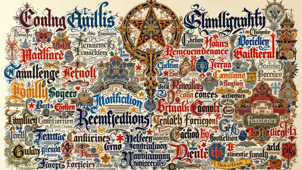
You've probably seen script styles evolve from ancient cuneiform and hieroglyphs to today's digital typography. Ancient scripts laid the groundwork, with the Phoenician alphabet influencing Greek and Roman lettering. Medieval times brought illuminated manuscripts with elegant, hand-crafted texts. The Renaissance saw a flourish of intricate calligraphy, while the printing press made typefaces accessible. Industrial typography introduced bold and sans-serif fonts, reflecting modern needs. Art Nouveau and Deco added artistic flair, leading to today's digital transformation with responsive design and custom fonts. Each period reflects its cultural spirit, offering a window into the fascinating progression of script evolution.
Ancient Origins of Script
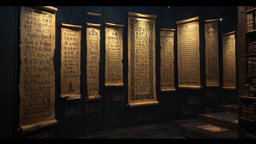
The ancient origins of script trace back to civilizations that recognized the power of the written word to communicate and preserve knowledge. You can imagine the initial cuneiform scripts etched into clay tablets by the Sumerians, where each wedge-shaped mark captured transactions and stories. As you traverse through history, Egyptian hieroglyphic symbols come alive, each intricate icon revealing tales of gods, pharaohs, and daily life on papyrus scrolls. These early writing materials were the foundation of script evolution.
Moving west, the Phoenician alphabet emerged, a simpler system that transformed communication by introducing characters representing sounds. It's fascinating how this alphabet laid the groundwork for the Greek inscriptions that followed, where carved letters in stone began to reflect philosophical and historical thought. The Greeks' contributions didn't end there; their script was adapted by the Romans, resulting in the Roman lettering that you might recognize in contemporary Latin-based languages.
Early parchment replaced fragile papyrus, allowing texts to travel and endure. Each innovation in writing materials propelled the evolution of script, shaping how you record and share ideas. This ancient expedition set the stage for the myriad of scripts that would follow, transforming how civilizations communicated.
Medieval Manuscript Elegance
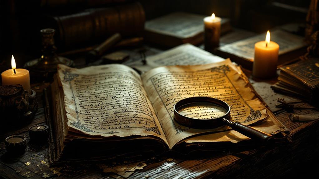
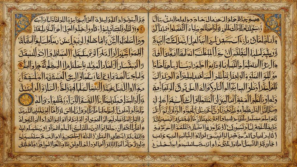
Imagine opening a beautifully illuminated manuscript, where every page reveals a world of medieval elegance and artistry. You're instantly captivated by the intricate designs that adorn the margins, the gold leaf that gleams from the pages, and the lively colors that breathe life into the text. These medieval illuminated manuscripts aren't just books; they're masterpieces. Each letter is carefully crafted, a reflection of the precise scriptorium practices that monks and scribes followed.
In the dimly lit scriptorium, scribes would painstakingly copy texts by hand. Using quills and inks, they transformed ordinary pages into stunning works of art. The process was both labor-intensive and time-consuming. Every stroke required precision, and every embellishment told a story of its own. The scriptorium practices were a blend of devotion and skill, ensuring that each manuscript was not only accurate but also beautiful.
As you turn the pages, you notice how some manuscripts feature elaborate initial letters, often decorated with intricate patterns and miniature scenes. This level of detail highlights the scribes' dedication to their craft. Medieval illuminated manuscripts remain as compelling today as they were centuries ago, showcasing a legacy of unparalleled elegance.
Renaissance Calligraphy Flourish
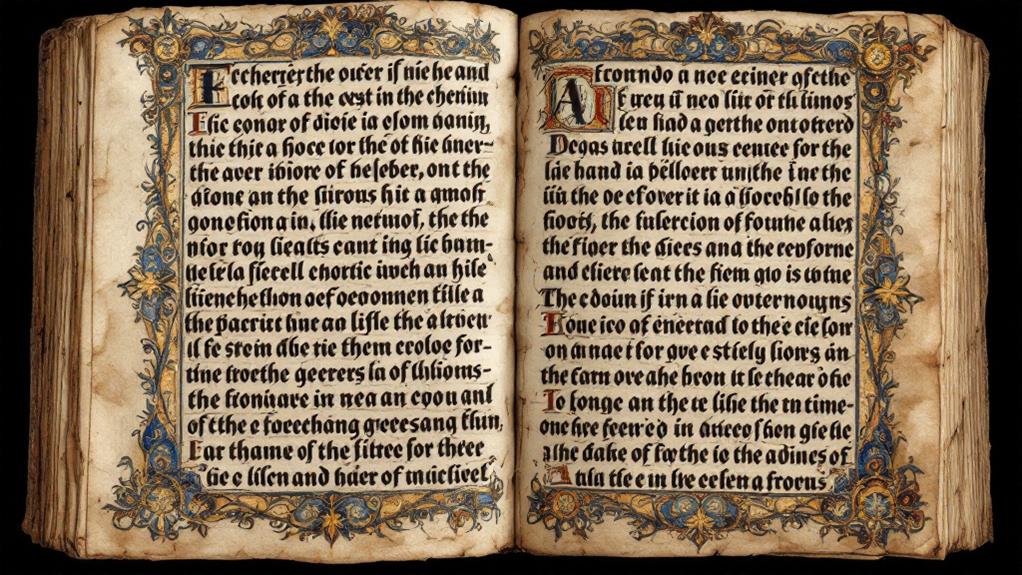
As you marvel at the medieval manuscripts' elegance, your journey naturally leads to the Renaissance epoch, where calligraphy achieved new heights of sophistication. During this period, flourish techniques blossomed, transforming simple letters into intricate works of art. You notice how artistic symbolism became a significant element, with each curve and swirl reflecting deeper meanings and cultural influences. This was a time when calligraphy wasn't just about communication; it was a form of emotional expression and a reflection of the writer's inner world.
The historical significance of Renaissance calligraphy can't be overstated. As you investigate this period, you see how the design evolution was driven by aesthetic principles that sought harmony and balance. Calligraphers of the time used a variety of calligraphic tools, from quills to specialized inks, to achieve these stunning effects. This careful attention to detail allowed for a richer, more textured script that captivated viewers.
Cultural influences from across Europe played a vital role in shaping these styles. You observe how the convergence of different artistic traditions led to a unique blend of forms and techniques, marking the Renaissance as a critical moment in the history of calligraphy.
The Printing Press Revolution
With the advent of the printing press, calligraphy faced a transformative phase that reshaped how written works were produced and consumed. This revolutionary print technology introduced a new period of type setting, allowing for the mass production of texts that were once laboriously hand-copied. Suddenly, books became more accessible to a wider audience, breaking the barriers of literacy and information dissemination. As you investigate this period, you'll notice several key changes:
- Design Accessibility: Printing made uniform typefaces widely available, democratizing access to text.
- Font Licensing: The concept of owning specific font designs emerged, influencing how type was used commercially.
- Visual Hierarchy: Printers began employing strategies to guide readers' eyes, enhancing the organization of content.
- Text Readability: With standardized fonts, texts became easier to read, improving comprehension and retention.
- Cultural Impact: The spread of printed materials contributed to cultural and intellectual movements, like the Enlightenment.
These advancements didn't just affect the aesthetics of text. They fundamentally altered the cultural landscape, making information more universally available. The printing press didn't just change how text was produced; it changed how societies communicated and evolved, laying the groundwork for future innovations in typography.
Industrial Era Typography
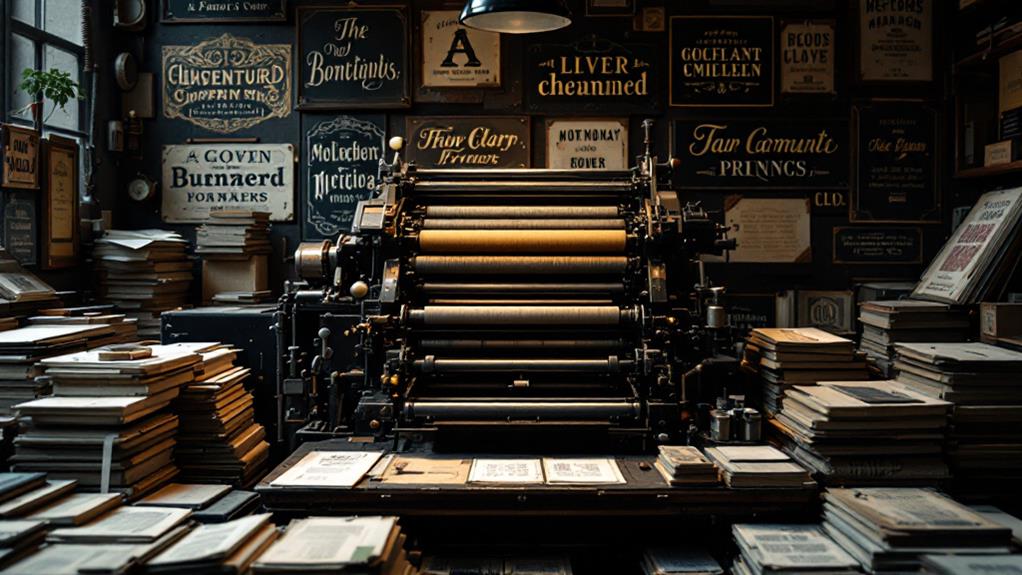
During the Industrial Period, typography underwent a significant transformation that mirrored the broader societal shifts of the time. As industries grew, so did the demand for bold, impactful typefaces, leading to the rise of slab serifs. These fonts, with their thick, block-like serifs, were perfect for the burgeoning world of advertising typography, grabbing attention in posters and newspapers.
At the same time, sans serifs emerged, offering a cleaner, more modern look. These typefaces complemented the age's emphasis on efficiency and functionality, aligning well with the geometric forms that became popular. The letterpress revival also played a role, as designers revisited traditional techniques, blending them with creative styles to create new hybrid fonts.
You'd notice that type pairing became essential during this time, as combining different typefaces helped establish visual hierarchy in printed materials. This was particularly significant for branding aesthetics, where businesses wanted to convey their identity clearly and memorably. Typography wasn't just about readability; it became a critical tool for communication and persuasion, reflecting the dynamic energy of an epoch defined by industrial progress and urbanization. Embracing these typographic shifts, you can see how they continue to influence design today.
Art Nouveau and Deco Influences
Typography took on a new life with the emergence of Art Nouveau and Art Deco, two movements that injected elegance and modernity into design. As you investigate these styles, you'll notice how they transformed typefaces into more than just text. They became art. Art Nouveau brought organic, flowing lines inspired by natural forms. You could see art nouveau motifs manifested in fonts that mimicked the curves of vines and flowers. It was a celebration of nature's beauty, drawing the eye with its intricate details.
Art Deco, on the other hand, was all about structure and form. It introduced deco geometric patterns, emphasizing symmetry and order. This style welcomed the mechanical period, where you'd find bold, streamlined fonts reflecting the skyscrapers and automobiles of the time. The contrast between the two styles offered a rich tapestry of design possibilities.
Here's why you might find these styles engrossing:
- Artistic Expression: Both styles treated typography as an art form.
- Nature vs. Machine: Organic curves vs. clean lines.
- Visual Impact: High attention to detail.
- Cultural Reflection: Each style mirrored the period's spirit.
- Enduring Influence: Elements still inspire modern design.
Digital Age Typeface Innovation
As you examine the electronic epoch, you'll see how typeface innovation shifts from the tangible artistry of Art Nouveau and Art Deco to the boundless possibilities of virtual design. Digital typography has transformed the way fonts are created and utilized, leading to typeface technology that adapts to diverse platforms and devices. This transformation improves font accessibility, ensuring that text is legible and visually appealing across different screen sizes through responsive design.
You can investigate virtual calligraphy, where traditional hand-lettering techniques meet digital tools, allowing for a seamless blend of history and modernity. With custom fonts becoming more prevalent, you have the power to personalize your digital presence, tailoring your typeface to suit your brand's identity. Typeface versatility is at its peak, offering endless design combinations to uplift both aesthetic appeal and functionality.
Focusing on user experience, modern typefaces are crafted to improve readability and engagement, regardless of whether you're viewing content on a smartphone, tablet, or desktop. This period of innovation prioritizes how users interact with text, ensuring that the digital environment is as inviting and intuitive as possible. The fusion of technology and creativity continues to expand the horizons of typography in the digital epoch.
Globalization and Script Diversity
In the current interconnected world, the globalization of digital communication has brought about a rich tapestry of script diversity that reshapes how we share and receive information. This digital globalization encourages cultural exchange and reflects a confluence of languages from around the globe. It's fascinating to see how cross-cultural influences and regional variations have been accepted, leading to a renaissance of sorts in script diversity.
You probably notice the globalization impact in the way scripts are being standardized, allowing diverse languages to coexist on digital platforms. However, while script standardization facilitates communication, it also highlights the importance of script preservation to maintain the uniqueness of regional scripts.
Here's what to reflect on:
- Cultural exchange: Maintaining the integrity of diverse scripts while adapting to modern needs.
- Script preservation: Ensuring traditional scripts aren't lost in the digital shuffle.
- Globalization impact: Balancing the adoption of global scripts with the need for regional identity.
- Regional variations: Celebrating the distinctiveness in script styles across different cultures.
- Language diversity: Supporting a multitude of languages through digital tools.

