Carolingian to Gothic Scripts: The Folio Evolution of Medieval Europe
Investigate how the evolution from Carolingian to Gothic scripts influenced medieval manuscripts and modern typography. Carolingian minuscule, introduced under Charlemagne, unified writing with clear lettering across his empire, enhancing religious and scholarly communications. As Europe entered the 12th century, Gothic scripts emerged, known for their angular, dense designs that optimized both parchment use and text production speed. These scripts added visual drama with elongated vertical strokes and ornate ligatures. The transformation profoundly impacted manuscript aesthetics and the intellectual landscape. By continuing, you'll uncover how these ancient scripts influence contemporary typeface design and visual communication.
The Rise of Carolingian Minuscule
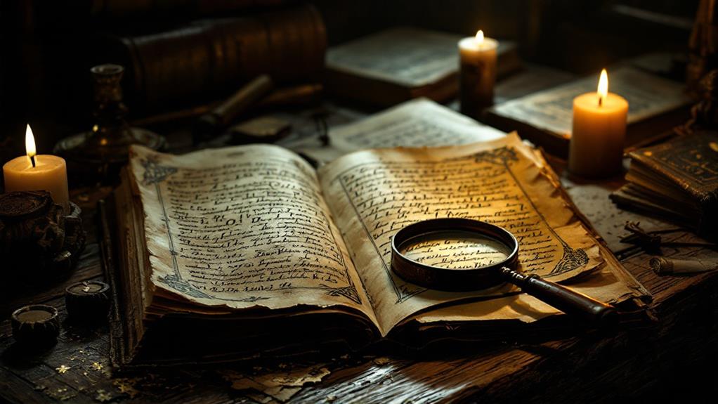
The rise of Carolingian minuscule marked a significant moment in the history of medieval European script. As you explore this period, you'll uncover how this script transformed manuscript preservation. Before its development, text was often cramped and difficult to read, making the preservation of knowledge a challenging task. Carolingian minuscule introduced clear and uniform lettering, which made written works more legible and easier to copy accurately. This innovation guaranteed that essential texts, especially religious and classical works, were preserved for future generations.
You'll also find that Carolingian minuscule played a significant role in cultural exchanges across Europe. As a standardized script, it allowed for smoother communication between scholars and scribes from different regions. This uniformity facilitated the sharing of ideas and knowledge, bridging the diverse linguistic landscapes of medieval Europe. Libraries adopting this script became hubs of intellectual activity, attracting scholars enthusiastic to exchange thoughts and texts. By promoting a shared literary culture, Carolingian minuscule contributed to the intellectual revival that characterized the Carolingian Renaissance. This script wasn't just a writing tool—it was a catalyst for the cultural and scholarly exchanges that transformed medieval European society.
Charlemagne's Script Reform
Charlemagne's vision for a unified domain extended beyond politics and warfare, reaching into the very scripts that recorded his empire's legacy. His influence on script standardization was profound, as he recognized the need for a consistent writing system across his vast territories. With this reform, you see how he sought to unify communication and guarantee clarity in official and religious texts. This wasn't just a bureaucratic move; it had deep cultural implications.
By implementing educational reforms, Charlemagne emphasized the importance of learning and literacy. He believed a standardized script would facilitate easier teaching and comprehension. You'd find that monastic scribes, who played a key role in this transformation, were central to maintaining literary preservation. They carefully copied texts, assuring that knowledge and culture were transmitted accurately across generations.
The script reform not only bolstered administrative efficiency but also enriched the cultural fabric of medieval Europe. It laid the groundwork for future intellectual revival during the Carolingian Renaissance. As you investigate this period, you'll appreciate how Charlemagne's foresight and commitment to standardization fostered a more interconnected and educated society, leaving an indelible mark on European history.
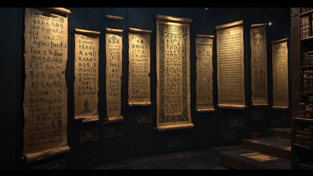
Transition to Gothic Scripts

Amid the evolving tapestry of medieval European scripts, the alteration to Gothic scripts marked a significant shift in the region's literary landscape. As you explore this transformation, you'll notice how the Gothic style emerged in the 12th century, reflecting the growing complexity of medieval calligraphy. Unlike its predecessor, the Carolingian minuscule, Gothic scripts accepted a more condensed and angular form, offering new script variations that influenced the way texts were written and read.
Consider these vivid elements that characterized the change:
- Textual Density: Gothic scripts enabled scribes to fit more text onto a single page, maximizing the use of expensive parchment or vellum.
- Vertical Emphasis: The scripts featured elongated vertical strokes, creating a more dramatic and imposing appearance compared to the rounded forms of earlier scripts.
- Complex Ligatures: Scribes employed intricate ligatures, where letters were combined into single glyphs, showcasing the ornate nature of medieval calligraphy.
- Regional Variations: Different regions developed unique script variations, such as the Textualis and Hybrida, illustrating the adaptability and diversity of Gothic writing.
This change wasn't just an aesthetic evolution but also a practical adaptation to the needs of an expanding scholarly and ecclesiastical audience.
Characteristics of Gothic Writing
Gothic writing captivates with its distinctive features that set it apart in the medieval script landscape. You can immediately recognize the gothic aesthetics through its angular, dense letter forms. These were developed during a historical context marked by the need to save space on expensive parchment, resulting in compact, vertically elongated characters. The calligraphic techniques used in Gothic scripts often involved precise, deliberate strokes, characterized by thick and thin lines that required skilled scribal practices.
As you investigate different manuscripts, you'll notice regional variations in Gothic writing. For instance, the Textura style is common in England and France, while the Rotunda style appears more frequently in Italy. These differences reflect local tastes and influences, adding a rich diversity to the gothic script tradition. Manuscript illumination often complemented these scripts, with intricate decorations and illustrations enhancing the text's visual appeal.
Gothic writing wasn't just about aesthetics; it was practical too. It allowed scribes to write quickly without lifting the pen too often, a technique vital for the production of large volumes of text. Each aspect of Gothic scripts—from letter forms to regional nuances—reveals the complexity and artistry behind medieval scribal practices.
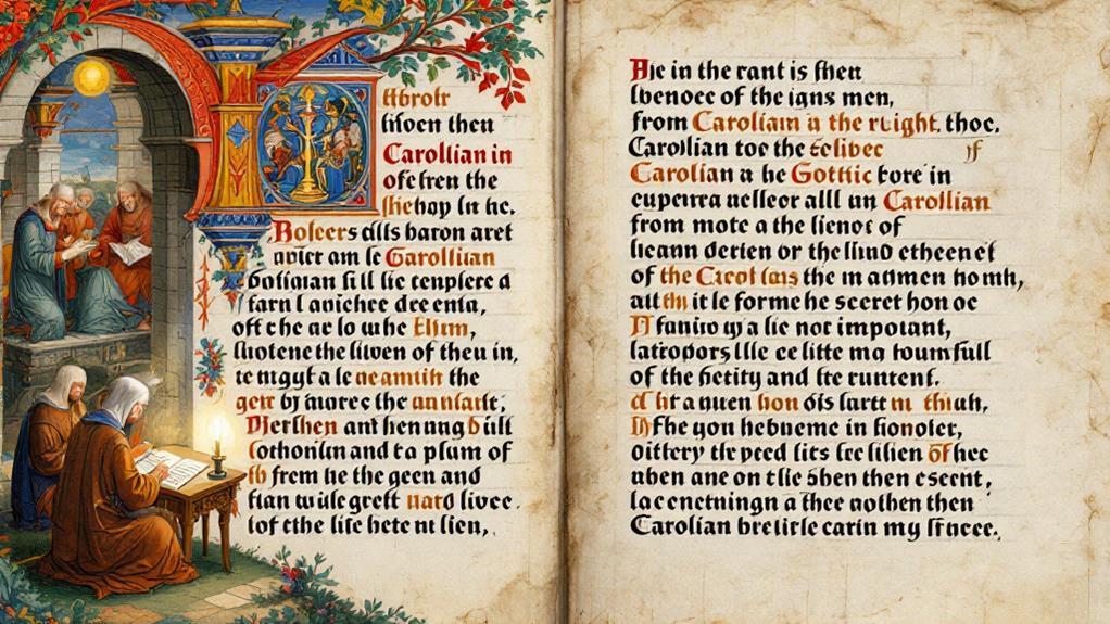
Influence on Manuscript Design
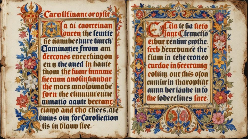
The influence of Gothic writing on manuscript design is profound, shaping both aesthetics and functionality in medieval book-making. This script's intricate style paved the way for more than just beautiful lettering; it also transformed the comprehensive look and feel of manuscripts. As you investigate these ancient texts, you'll notice how Gothic writing led to more elaborate manuscript illumination, enhancing visual appeal and narrative depth.
Markdown list to illustrate this transformation:
- Dense Lettering: The compact nature of Gothic script optimized space on expensive parchment, allowing more text per page.
- Elaborate Borders: Intricate borders were often filled with flora, fauna, and fantastical creatures, reflecting a fusion of artistic styles through cultural exchange.
- Decorative Initials: Large, ornate initials introduced sections or chapters, providing visual guidance and focus for readers.
- Brilliant Colors: Rich hues from illuminated letters and illustrations made manuscripts lively and engaging, capturing the reader's imagination.
In each illuminated page, the cultural exchange is evident, as local stylistic elements blended with new influences. Gothic script didn't just change how people read; it enriched the entire manuscript experience, making it a feast for both the eyes and the mind.
Legacy in Modern Typography
Centuries later, the legacy of medieval manuscript design continues to influence modern typography in profound ways. You can see this in the revival of historical scripts that inspire many modern typefaces. Designers often draw from the rich heritage of Carolingian and Gothic scripts, integrating their unique characteristics into contemporary fonts. This script revival isn't just about nostalgia; it's a demonstration of the timeless beauty of these ancient forms.
In today's electronic era, digital typography harnesses the power of these historical designs, making them accessible to a global audience. With countless fonts just a click away, you can appreciate how these medieval influences have been adapted for screens, enhancing readability and aesthetic appeal. Historical preservation plays a critical role here, as it guarantees the authenticity of these designs while allowing for creative reinterpretation.
When you investigate modern typefaces, you're engaging with a tradition that spans centuries. This connection between past and present underscores the enduring impact of medieval scripts. By incorporating elements of these time-honored styles, modern typography not only honors history but also enriches your visual experience, blending tradition with innovation in every keystroke.
Related posts